Tyler, Hunter, and I were a team for Ludum Dare 38 the weekend of April 21st, and we streamed the whole thing. We made a silly game about bees! You can play it here, and you can view the source here.
For those of you who are unfamiliar, Ludum Dare is a tri-annual game jam where you try to make a game around the event’s theme, start to finish, in a weekend. (If you’re solo, you get 48 hours; if you’re a team you get 72 — here are the rules, if you’re interested.) The theme this time was Small World, so we ended up on bees making a hive. We like animals, I guess.
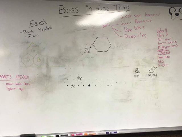
I wish we had better documented our creative process, because we made a lot of our core design decisions either because they were cute or hilarious, and there is very little chance I can deliver any of the awful puns we made that weekend in a way that does them justice in this blog post. If you were watching the Twitch stream, you likely heard us playing music by the Beegees, the Beatles, Beyonce, the Beastie Boys, the B-52s… (Relatedly, we learned that Twitch doesn’t save your VODs automatically anymore unless you enable that for your account. Oops.) Luckily, we did preserve some of our early whiteboard notes:

(If you don’t care about the various kinds of design issues we encountered, you’re done reading at this point! Yay!)
Our control scheme is very silly (it is centered on the b key, I am not explaining why), and it actually caused some really interesting design decisions to crop up. Since we decided early on that we wanted “b” to be our action key, and that we would let players navigate around the hive with a cursor in order to expand their world, we needed navigation input that made sense with respect to the b key. Looking at a computer keyboard, we realized (and I think Nick suggested the original form of this idea) that if we turned the hexes vertically, the v, g, h, and n keys were all adjacent to an imaginary “focused” hex — the b key. Now we could navigate left, up-left, up-right, right, and take an action. Cool (?). I think this made our action button a more justified decision — since the b key now symbolized the “focused” hex, pressing it more intuitively meant “take an action HERE,” which is what pressing it always did.
The next issue this caused was that we needed a way to get back down, but were so set on the pun that we tried to think of an alternative way to express “down” rather than fix what was arguably broken. We ended up taking warped, marred instruction from design language on mobile devices (despite that this game will super-not-work on mobile, you need a keyboard) and using a quick-press of spacebar to mean “go back one move” and a long-press of spacebar to mean “go back to the start.” Since you start the game on the bottom row, this meant you could now get anywhere on any board. Great (?).
(Amateur tip: Probably do not design your navigation controls around a pun if intuitive controls are more important to you than bad jokes.)
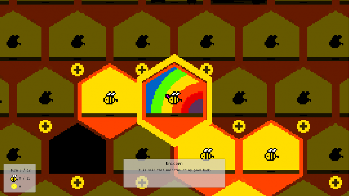
Not only did we have to fight through all of that, but the control scheme choice hit us again later! When Tyler was trying to pixel the hexes, he realized their angled floors didn’t mesh well with his vision. He wanted to decorate the hexes as bedrooms or otherwise “home environment” rooms for the special bees and upgrades, but with the floors being angled instead of flat, it was difficult to come up with a place to put decor. We ended up filling the angled bottoms of the hexes to flatten them out, and we’re happy with the result — now the frames of the hexes look like cute little houses.
I have some regrets about how I set up the map. Since the map is comprised of layered rows of hexes, I realized immediately that we might have issues navigating via math. For some inane reason, I determined that the simplest way to handle the situation would be to model the map in code as a 1d array. This was a mistake. Determining what row you were on was really important for determining adjacency (which is how we know which hexes you can buy next), and so was a very common operation. It had to be abstracted into its own function. It is clever before it is elegant. I am not proud. In fact, I’m not proud of a lot of this code. But that’s okay. It works. Except for adjacency sometimes.
All in all, it was a really great weekend. Despite what it may sound like, I’m incredibly proud of the fact that we finished something playable as a game. Tyler did an amazing job with the pixel art, and Hunter is the only reason there is any guidance in the entire game on what to do (the tutorial, mentioning the rockets at the loss screen, the entire end cutscene’s code, and the upgrade text and descriptions — and the UI elements supporting them — were all him). I’m really glad we got to work together on this and I hope we do more in the future. 🙂

