As some of the long-time members and visitors may recall, the Makers Local 256 logo and designs have evolved quite a bit over the years. From elaborate scroll-work, to pointilistic gradients, to hairline negative-space tools, our logo has been there to show the world who we are, what we make, and why we’re here.
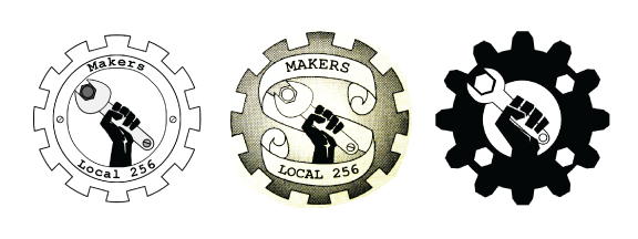
Each iteration served as chance to make the logo cleaner, easier to see, and easier to fabricate. Even our current logo has room to grow so that we can make better vinyl stickers, smaller icons, more visible social media graphics, and so much more.
So today, I’m happy to bring you the next evolution of our logo.

This new logo has been rebuilt from scratch to capture the essence of what it means to be a Maker. Special attention was paid to the radial symmetry provided by our iconic gear shape, and most of the design is carved out of concentric circles.
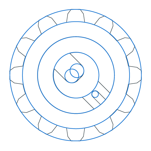
I wanted to make sure that the new design was as “Make-able” as possible, so I took care to create something that was a single contiguous piece. When cutting it on the vinyl cutter, there are only two easy islands to weed out, and our machine should be able to cut stickers as small as 1″x1″.
I’ve modified the banner image we’ve used in our social media to use the new logo:
You’ll notice a few fun goodies in here. First, I’ve standardized on two “official” ML256 typefaces: “Monteserrat” and “Quicksand”. Both of these typefaces are free and open source under the SIL Open Font License (OFL). I wanted to ensure that anyone has access to these typefaces without having to fork over loads of cash for something from one of the large foundries.
Second, I wanted to capture another Maker staple: color. Whether it’s RGB LEDs, neon acrylic lasercuttings, vibrant cosplay outfits, or powder-coated tools, Makers are drawn to usage of many wonderful colors in their creations. I’ve picked our official colors from the Google Material Design palette, further reiterating our use of materials and tools to create new projects.
The design works well in the official colors (inverted or not), as well as black and white:
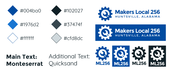
Above are a view variations of the logo that can be used in different situations. The wide logo with the full text works well in banners and as a header or footer of a page. the shorthand name designs can be used where space is tight or shaped more squarely.
Thanks for reading through this monster of a wall of text and images and I really hope that you enjoy the results of what I’ve worked on these past few months. I love Makers Local 256, and I am always excited to see what tomorrow will bring.
Cheers, and keep on Making!
Tyler Crumpton
