Branding guidelines
From Makers Local 256
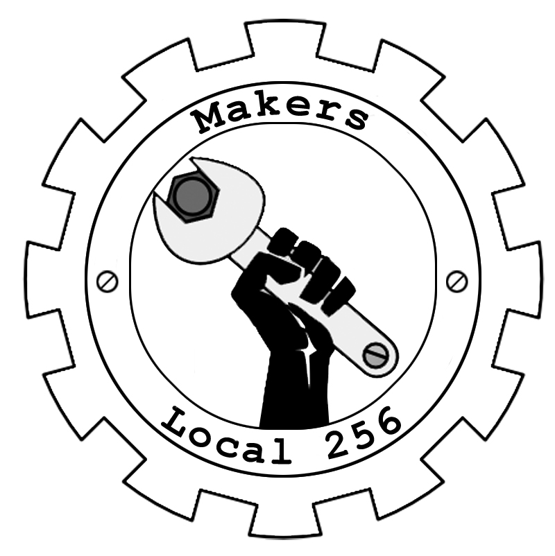
This was generated hastily in Photoshop, not vector software like Illustrator or Freehand which would keep all lines crisp and smooth. This is a quickie, what I call a 'proof.'
We talked a little at the last open house about changing the Makers Local logo just a little bit. I wanted something that would get rid of the difficult gradient and similar gray tones, but that would still show that we were about tech and engineering and keep the emphasis in the middle.
So I made the gear a little more complicated, added some bolts and an inset to it, and got rid of the gradient. I flat out removed the paper scroll with our name and just set it as a part of the gear. I need to go back and make it all caps.
